Qualys
Digital Campaign
Concept Development
The assignment was to develop concepts for a digital campaign for Qualys — a cybersecurity software company.
Goal: Present three distinct visual concepts for a series of digital ads on LinkedIn and the 6sense display network. The concepts should be visually arresting enough to stop someone in their daily scroll and still have some identifiable tie to the Qualys brand.
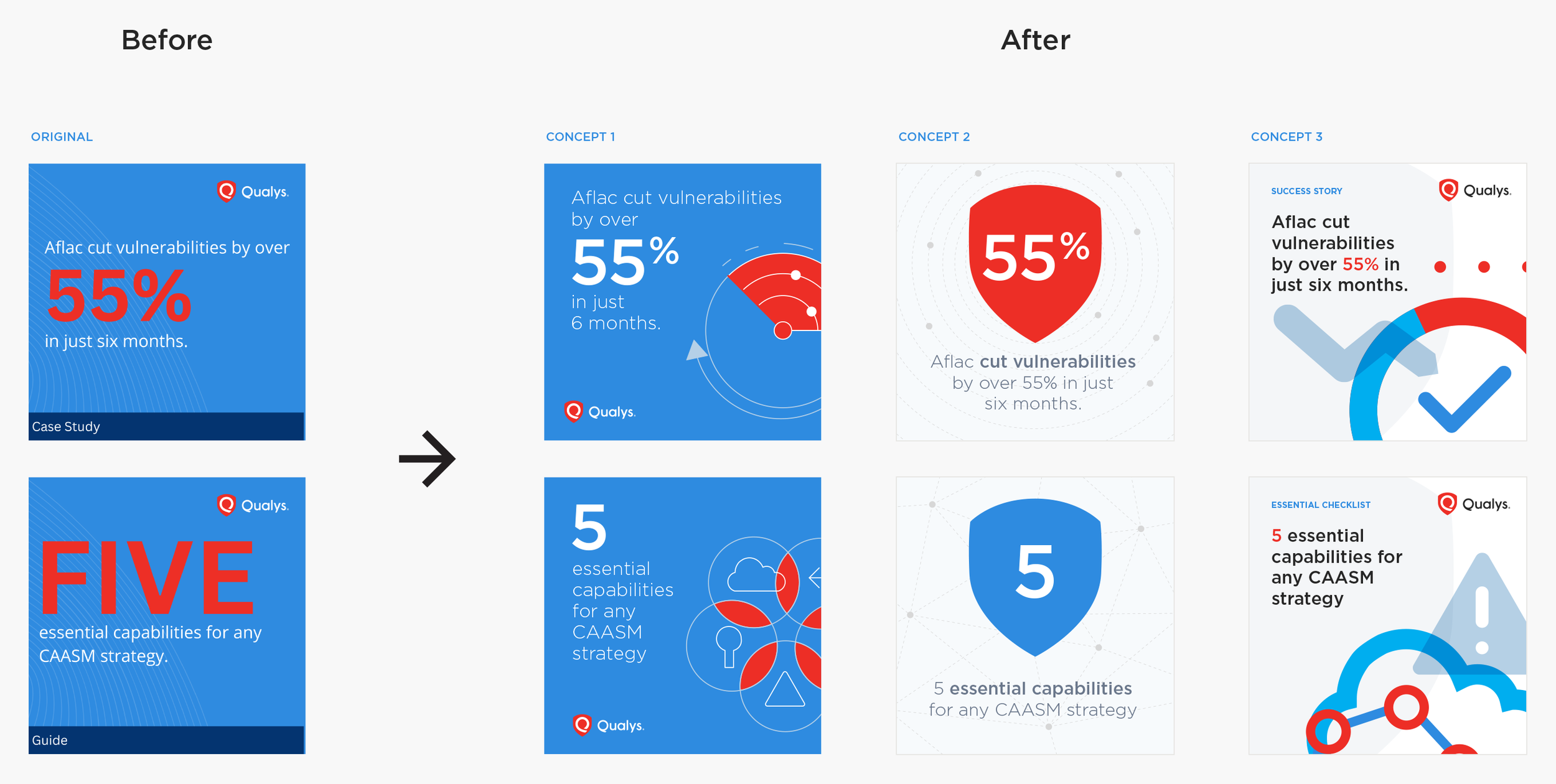
I presented four concepts.
Concept
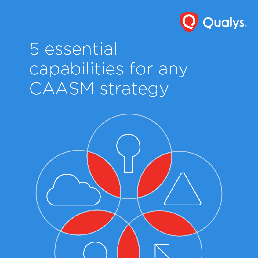
1. Fresh translation from icons to illustrations
Concept 1 translates the icon style into line illustrations for a fresh look & feel. Subtly used Sky Blue and White for lines.
LinkedIn Ads

Variations
Another layout: Centering the illustrations without emphasizing the numbers in the text to simplify further.

The existing brand background is added to integrate with the illustrations.

Display Ads
A white outline is added to the button to pop from the blue background.
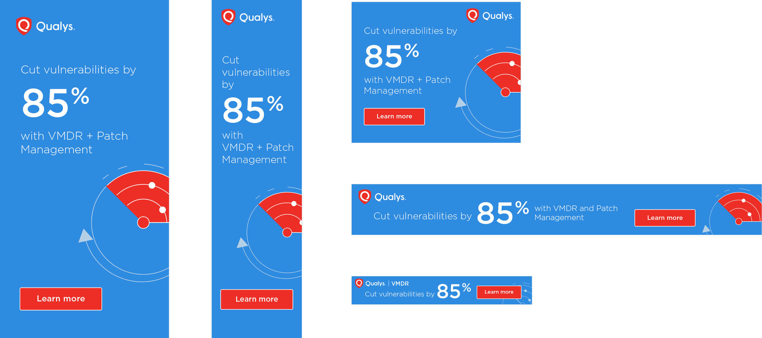
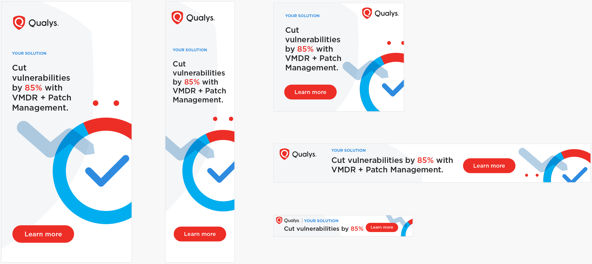
Concept
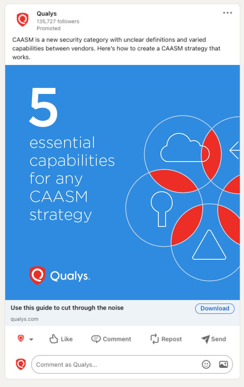
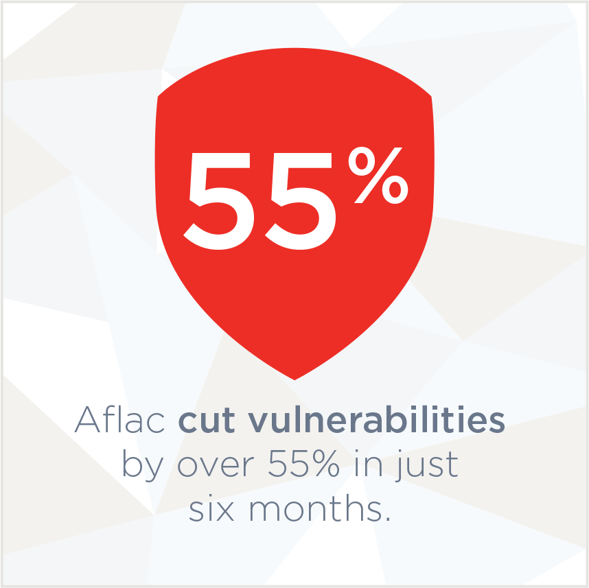
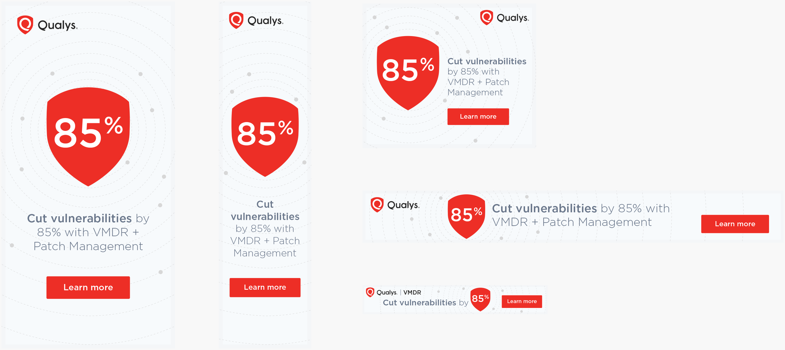
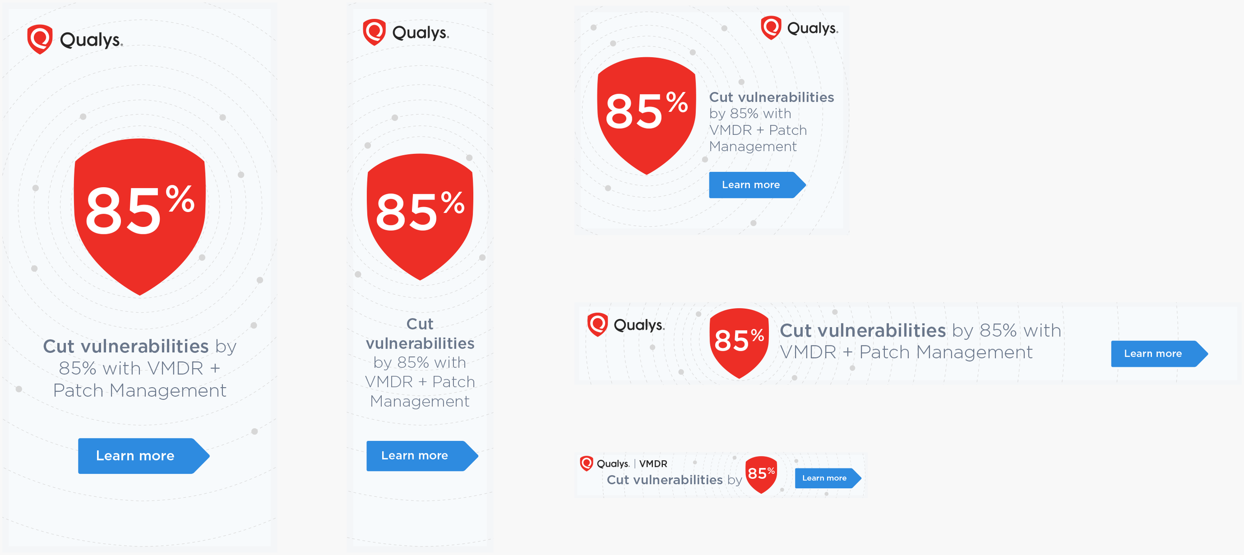
2. Straightforward visuals with light background
In Concept 2, the logo shape with a large number is used to promote the Qualys brand straightforwardly. The subtle and light background makes them look less advertisement-like. A simple centered layout. Essential words are emphasized in the text for easy scanning.
LinkedIn Ads
Variations
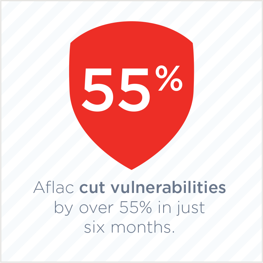
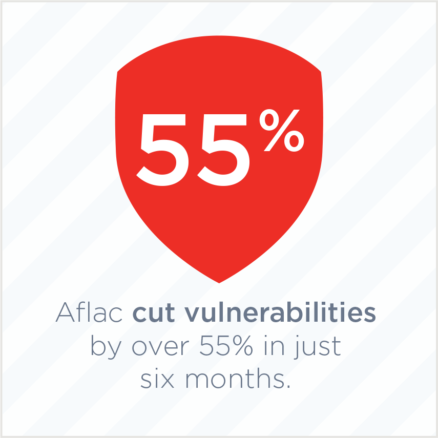
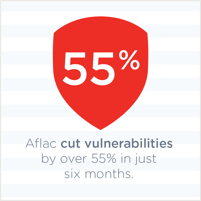
I’ve explored some options for the background. I tried to retain the feeling of cybersecurity but kept them light and simple. They don’t disturb the messaging.

Display Ads
A light gray outline is applied to each ad.
I tried out a blue button with an arrow shape. (It could be tested against the red button.)
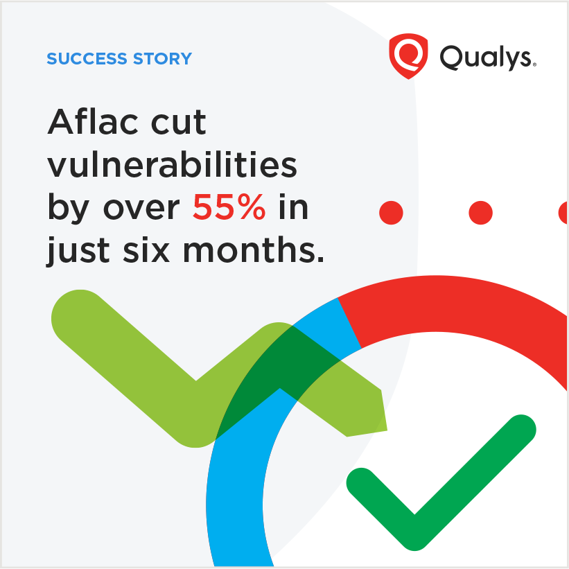
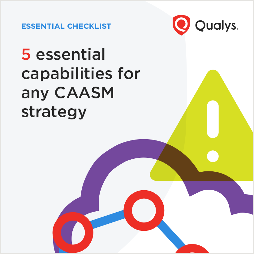
Concept
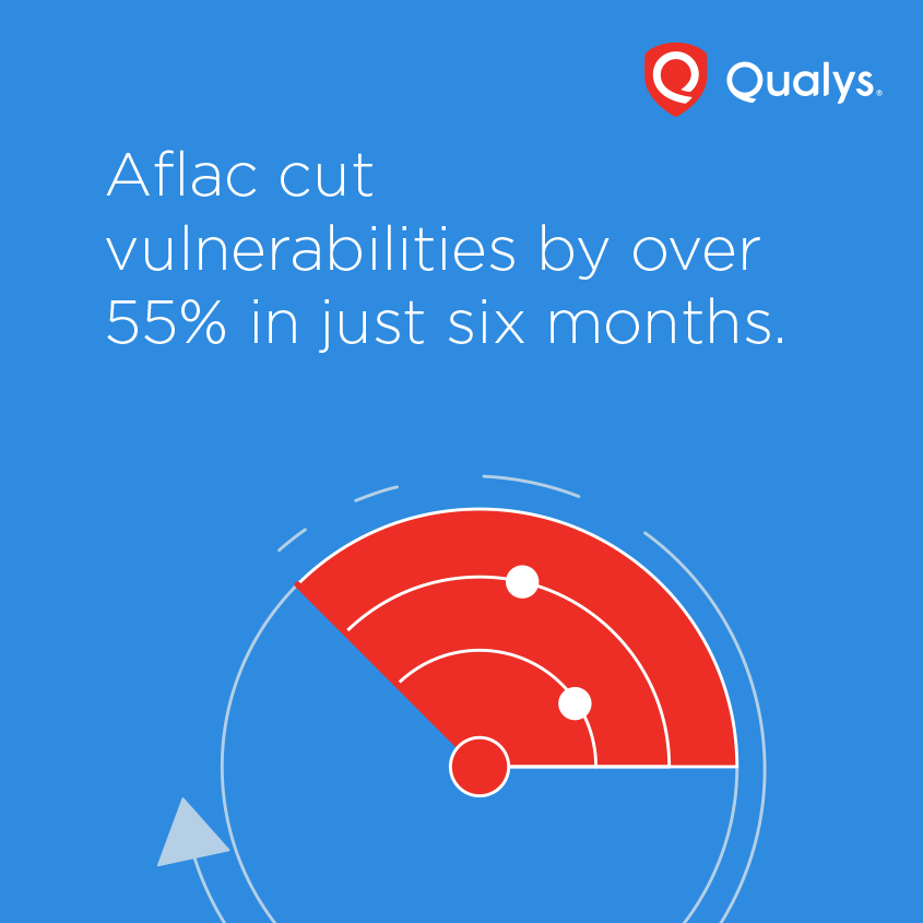
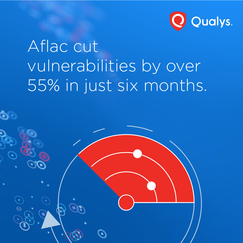
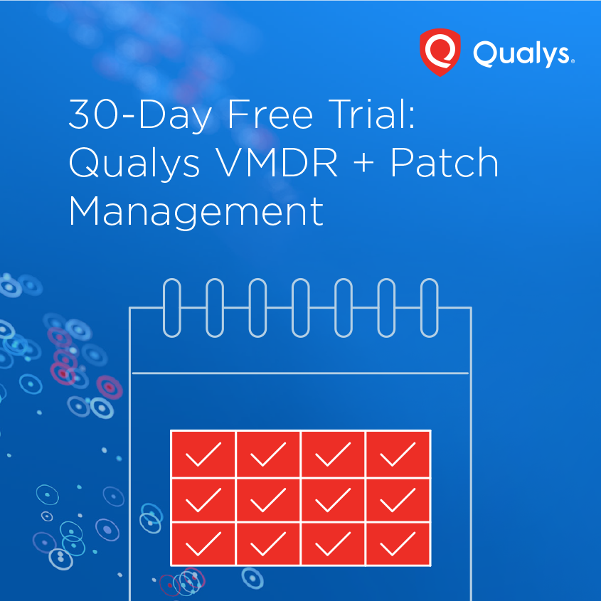
3. Bold illustration to push the brand's visual language
An option to push the brand a bit further to grab more attention. I added eyebrow text. I made the number in the text red to resonate with the illustration style. The light gray shape in the background is an oversized logo shape to add some interest and consistency.
LinkedIn Ads
Variations
I tried out more colorful options. It may be a bit too far from the brand.
Display Ads
I used the rounded button to resonate with the illustration style. The shape may perform better as it’s instantly recognizable as a button.
Concept
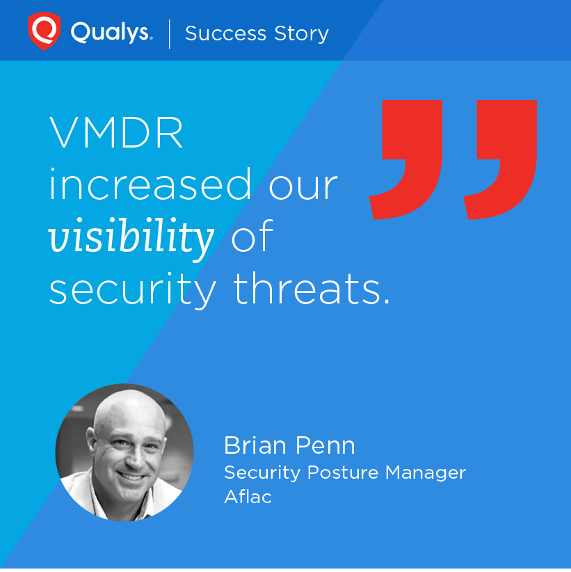
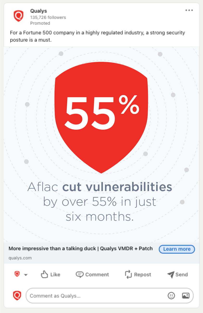
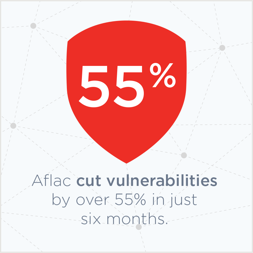
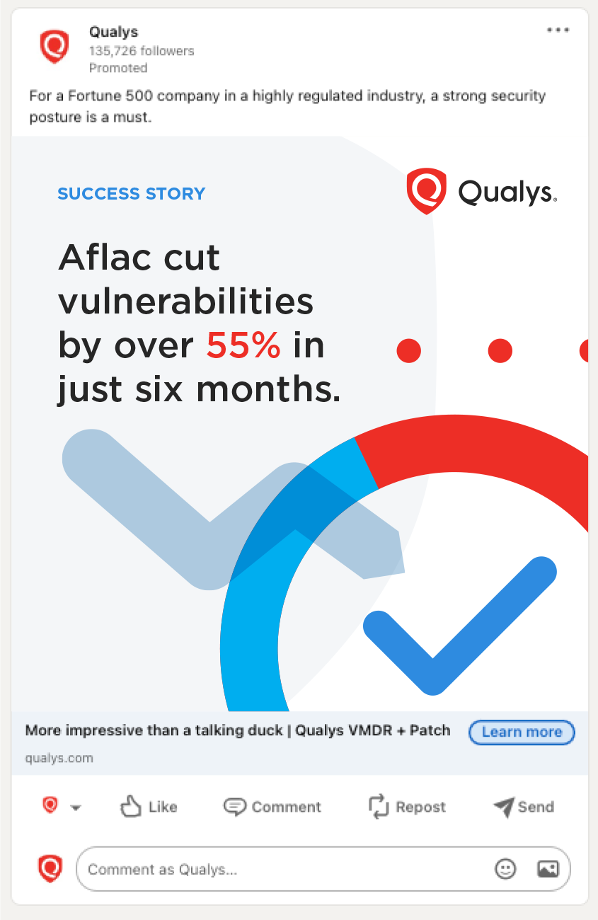
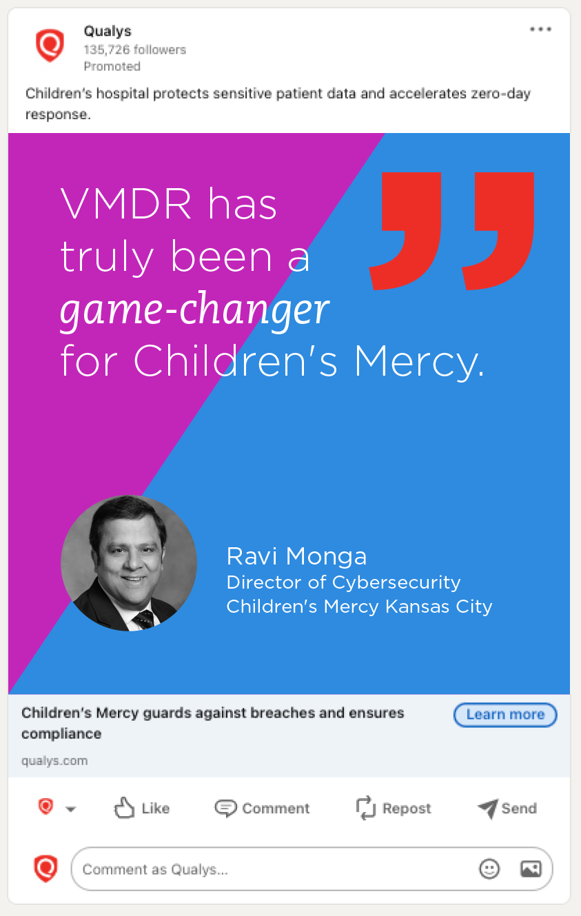
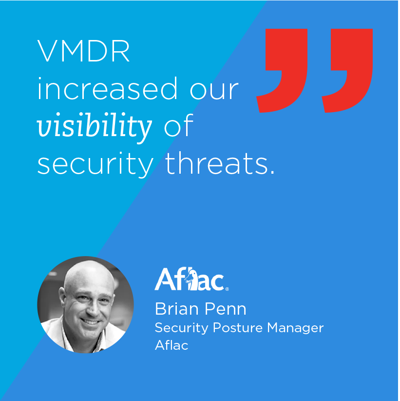
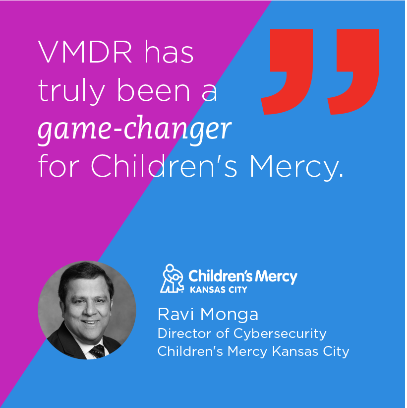
4. Softer approach for case study
I thought it would be interesting to try out the client testimonials for LinkedIn. The different colors (picked from the landing pages) represent various clients and are combined with Qualys blue. The critical words are emphasized with Caecilia Italic. I used black & white photos to create consistency. The huge quotation mark adds visual interest. This would realistically require permission/approval from clients.
LinkedIn Ads

Variations
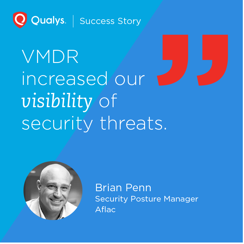
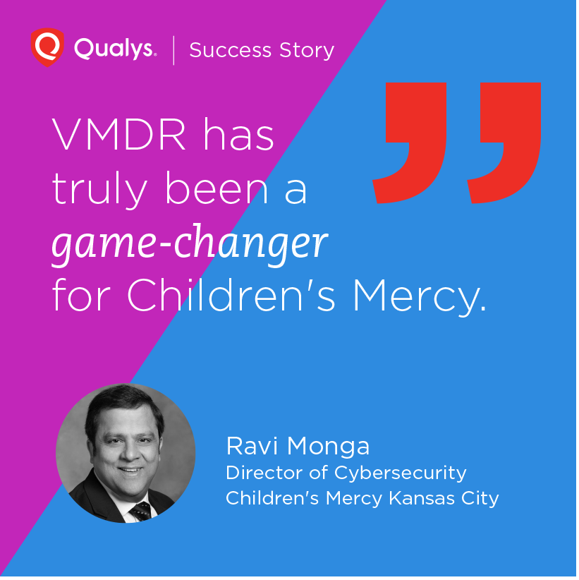
The company logos are added.
“Qualys logo | Success Story” is added.
Another treatment of the header part.